Choosing a color palette for your OCs!
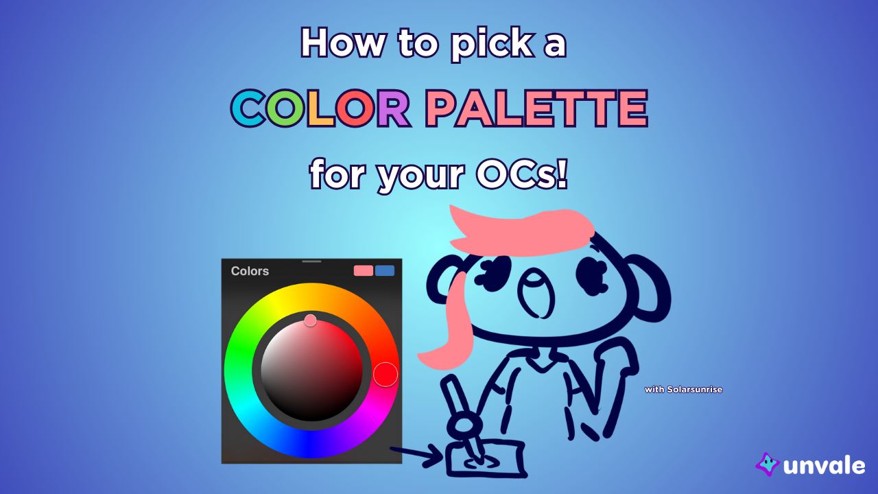
If you know me, you know I love a good colour palette; and so does the rest of the Unvale team! In this article, we’ll be covering some suggestions for picking the perfect partner palette for your pocket pals - er, your OCs! There are lots of different methods, so choose whatever sparks inspiration.
Colour Symbolism
There are many different meanings to colours based on different cultures; for instance, some places use black as a mourning colour, while others wear white, and some places wear white for weddings, while others wear red. Here’s a short list of what colours are usually associated with what. You might get different results if you ask different people or look up what colours mean, and I encourage you to do so!
- Red: Fire, warmth, danger, and good fortune. Red-coded characters are often energetic and bold.
- Orange: The sun, brightness, autumn, and sunsets. Orange-coded characters might be the friendly one in the group.
- Yellow: Caution, fear, happiness, and joy. Yellow-coded characters are often the sunniest of the bunch.
- Green: Nature, envy, nurturing, and stability. Green-coded characters are often grounded and wise.
- Blue: Water, calmness, cold, and knowledge. Blue-coded characters usually balance out their red counterparts with a more sensible viewpoint.
- Purple: Royalty, mystery, obscurity, and darkness. Purple-coded characters are usually the most mysterious and aloof of the bunch.
Do any of these concepts match your characters? Or maybe your character breaks these ideas entirely! Either way, if you want a quick shortcut to let people know your character’s vibe, colour symbolism is highly effective!
Colour Picking
Colour picking refers to a common digital art program feature that copies a colour from an image into a colour hex or onto a colour wheel. You can do this with traditional art too, of course, though not as accurately. Here’s a list of a few things you could colour pick for an OC’s palette!
- A favourite piece of art (remember to credit the reference you used!).
- A photograph, like of a sunset or a garden.
- An online moodboard (be careful not to use anything AI generated).
- An animal like a bird or a fish.
- A weapon or item from your favourite video game.
- The colours of your current outfit.
Saturation and Tint
Even if two OCs both wear a red t-shirt, the actual colour of each shirt likely won’t be exactly the same. This is due to saturation and tint.
Saturation refers to how ‘bright’ the colour is. For example, children’s shows have a high saturation level to catch the interest of their audience, and black and white media can be said to have zero saturation. Highly saturated colours are often associated with bright and cheery characters, or generally heroic ones, while less saturated colours are usually associated with more dark and gloomy, potentially villainous characters. However, pastel colours are low-saturation as well, so what gives? Well, a colour’s tint can also affect how it’s seen.
Tint refers to the black or white value of a colour. Go too far in either tint direction, and a colour will become black or white. Pastel colours as mentioned before, are white-tinted with lower saturation. Navy blue or camo green would be the opposite, with a dark tint and high saturation.
Think about how you can mix tints and saturations in a design. For example, maybe your OC dresses in mostly black and has bright red eyes to stand out against the outfit. A solid black outfit can be difficult to pick out, so I’d recommend using a low-saturation black-tinted blue in place of black in some places to break up the outfit as well. You can also pull more red into the outfit to break it up, using the same red as the character’s eyes. And voila! A more complex and layered outfit. An otherwise dark outfit with splashes of bright colour can give a character a toxic look, like a poison dart frog or monarch butterfly, so don’t be afraid to throw in a little dash of colour.

Bonus! How Solar Chooses Colours
I’ve been drawing for years now, and one of the things people tell me most often is that they love the colours I use. Here are some tips for colouring similarly to me.
- Never use pure black unless it’s in line art. If there’s nothing darker than it, it’s basically impossible to shade correctly! Using a dark grey or a low-saturation dark blue can often replace black. “But what if I want my character to be stealthy?” That’s a great question! Pure black stands out in shadow, since it’s darker than the shadows themselves. Shadows are also slightly tinted by ambient light, such as from the sky or candle light. So in terms of actual stealthiness, what I suggested would work better than just pure black. After all, if there’s no light at all anyways, it doesn’t matter what you wear to sneak around!
- Pick a colour theme for each OC in a group. It can be a few colours, a specific palette, or one specific colour. Having that colour set in stone to design around can help a ton! For instance in my personal work Heart Engine, Cardinal and Raven Mask both have black as a major part of their palette, but each has their own ‘theme colour’. Cardinal’s is red and Raven Mask’s is purple. Both have their own accent colour as well that breaks up their designs; gold and blue respectively. So keeping these main colours in mind when designing in the future, these are the colours I want to be the most prominent and consistent. Theme colours can help your character be more recognizable and iconic, but they’re never a necessity!
- Use colours as a functional feature in clothing. Would the colours of your OC’s outfit be useful for what you want them to do? Do they tell the story you want them to? To use the characters I mentioned before as an example, let me go into the reasons I chose the colours for each.
- Cardinal, as her name implies, is themed after the bird of the same name, and red is a colour of good fortune in her native Chinese culture. Another aspect to her design and colour story is the western mythology of the Phoenix, a bird with the power of resurrection from fire. So with all these combined, a firey red design with mystical gold detailing is appropriate for her. Can you guess what her superpower is from that, or if she’s a heroine or a villain from her colour saturation?
- Next is Raven Mask, named after another bird. Her outfit features lots of low saturation purples and darker colours. While her white hair keeps her from being properly sneaky, I wanted to give her the appearance of a mastermind behind the scenes with an elegant and powerful vibe. Purple is often associated with royalty, while adding a splash of bright blue to her pupils gives her a supernatural air and a somewhat mysterious appearance. I added blue roses to the latest version of her design; using flower symbolism, blue roses represent a miracle. So, what sort of vibe does Raven Mask give off? If her colours changed to yellow, would she still have the same effect?
Online Resources
If you just want to randomize a nice, cohesive palette, I’d recommend the site Coolors. While some features are blocked behind a paywall, the basics of the site are free! The site creates randomized palettes with hex codes for artist usage, which can be very helpful for exploring potential palettes and getting your creative juices flowing.
⭐⭐⭐
Show off your colourful OCs with this template made by the Unvale staff! Use #UVOCrainbow if you want to show off what you’ve created with the template. We’re excited to see what sort of colourful creations you’ve got to share!