Finding Inspiration in Some of the Cutest Indie Games of 2022
Taking a deeper look at the art of the cutest indie games is a great way to study and improve at creating stylized art. Join us at UnVale as we showcase and study some of the art behind the cutest indie games so far this year.
As an artist, knowing how to stylize your work can be really difficult to master. Simplified cute characters with bold color choices have been very popular lately, but not everyone is familiar with creating those types of works. Indie games in particular often feature a wholesome and otherworldly aesthetic of which we can't get enough. Taking a deeper look at the art of these heartwarmingly cute games is a great way to study and improve at creating stylized art. Join us at UnVale as we showcase and study some of the art behind the cutest indie games so far this year.
Studying the super cute works of these games can also help us to explore new aspects of our own art styles. We can study from the stylized art in recent games like Bear and Breakfast, Ooblets, Cat Cafe Manger, or Slime Rancher 2 to understand different aspects and techniques of creating such works.
Through the skillful use of elements like simplified character designs, specific color schemes, and detailed environment art, these games highlight different aspects of cute art; they show that by studying and learning these techniques, you too can create masterfully stylized art.
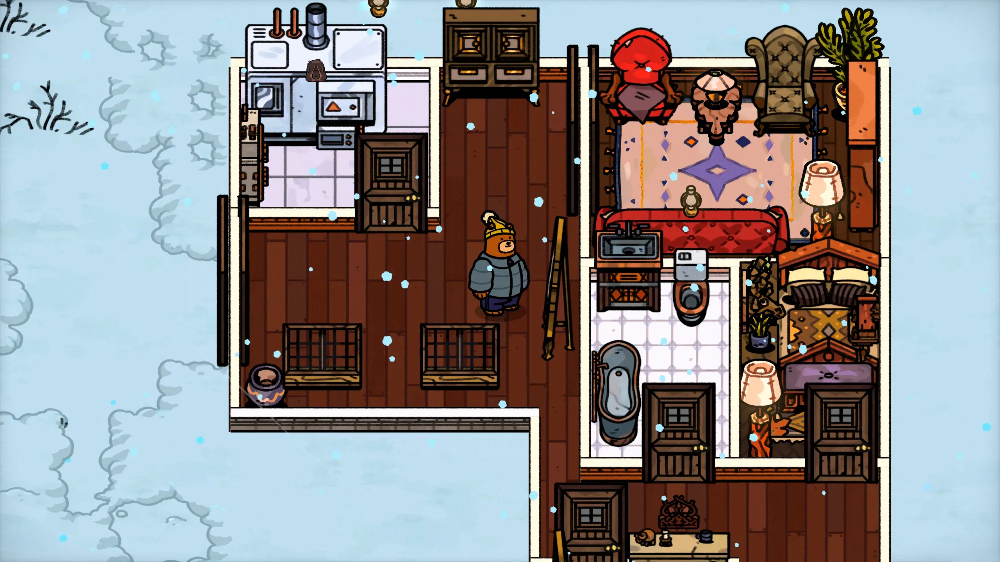
Bear and Breakfast
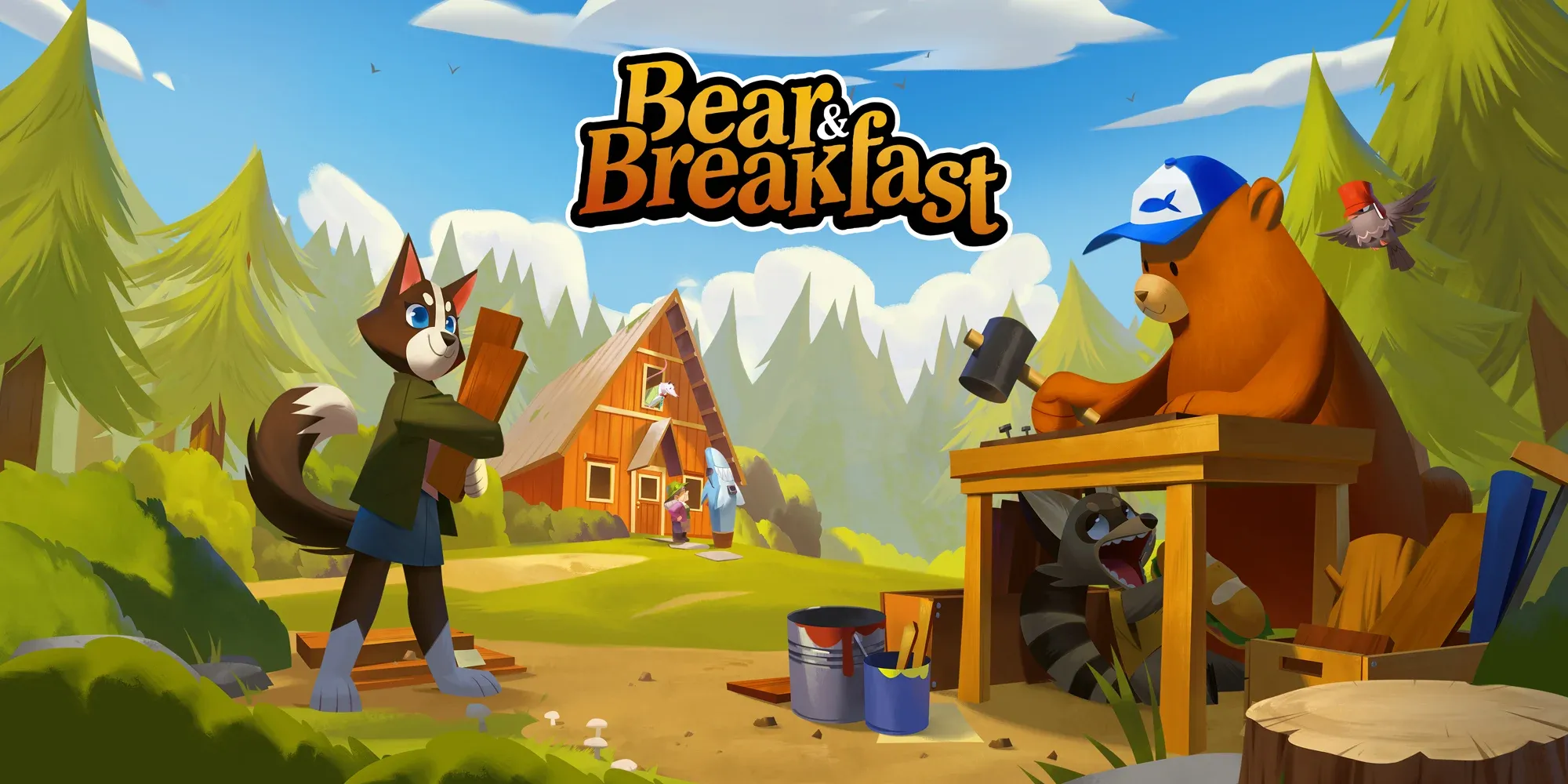
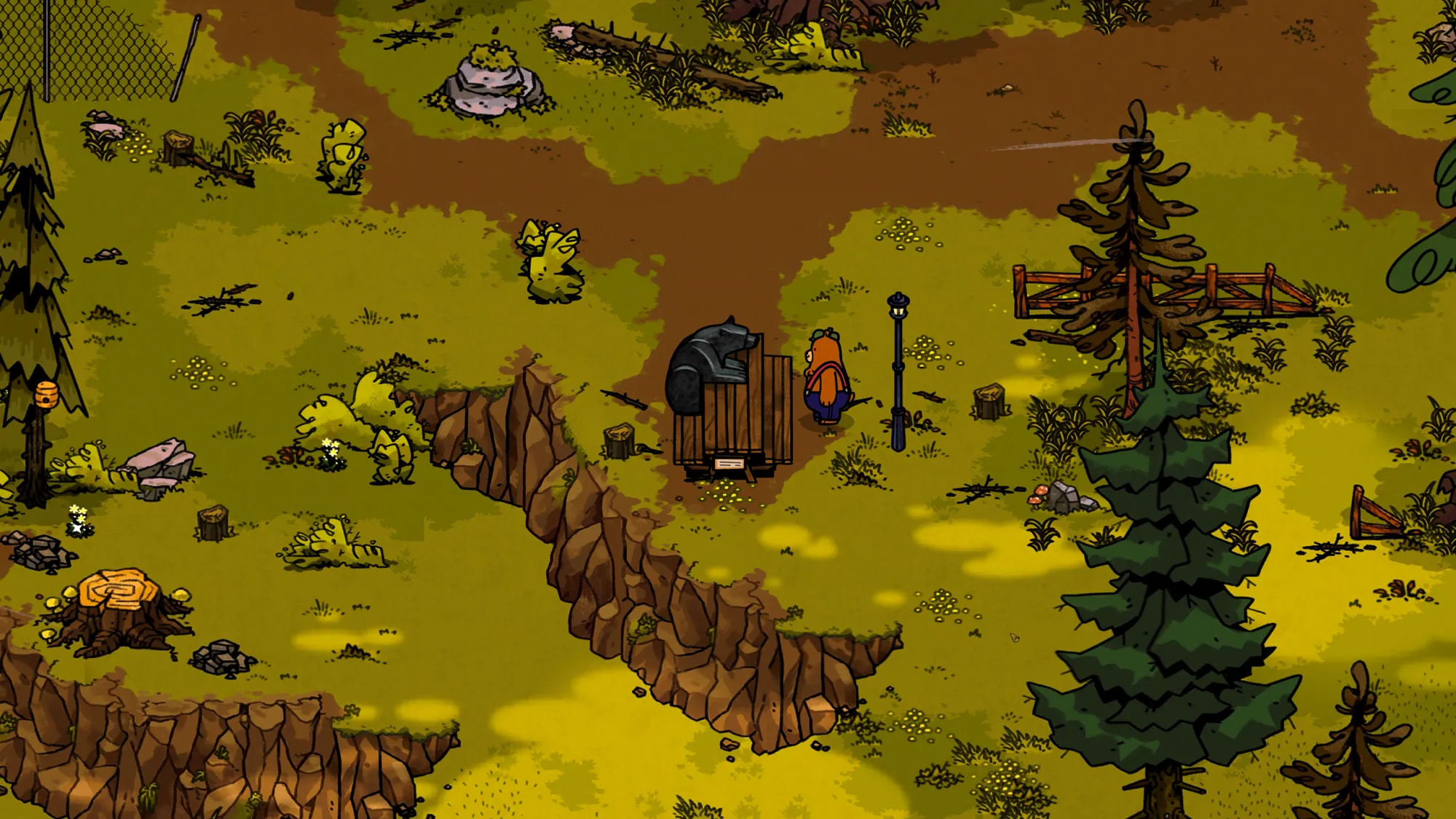
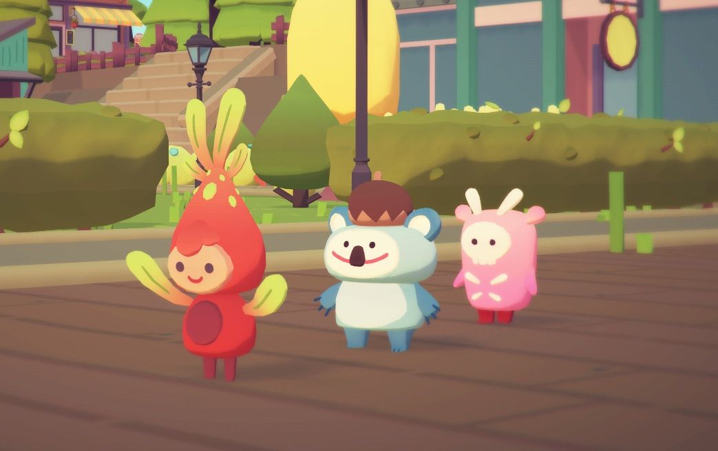
Bear and Breakfast is a laidback adventure management game where you play as an adorable bear named Hank trying to run a successful B+B in the woods. This game is a story-rich exploration game featuring vivid artwork of cute anthropomorphic characters.
This game makes amazing use of stylized character art to give a really personal and warm feeling to the overall world. The characters are anthropomorphic animals, which makes them feel a bit surreal, but also very relatable.
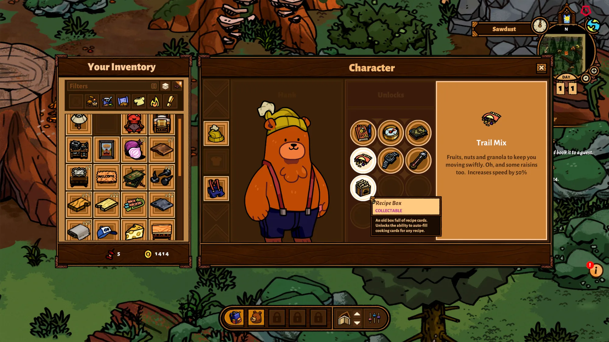
Take this image of the main character screen. Hank is drawn with very simple and distinct shapes in mind. He has an easy-to-draw shape--largely made up of simple circles and cylinders-- that manages to be charming with only a handful of lines. He wears any number of adorable outfits and accessories which add depth to the character.
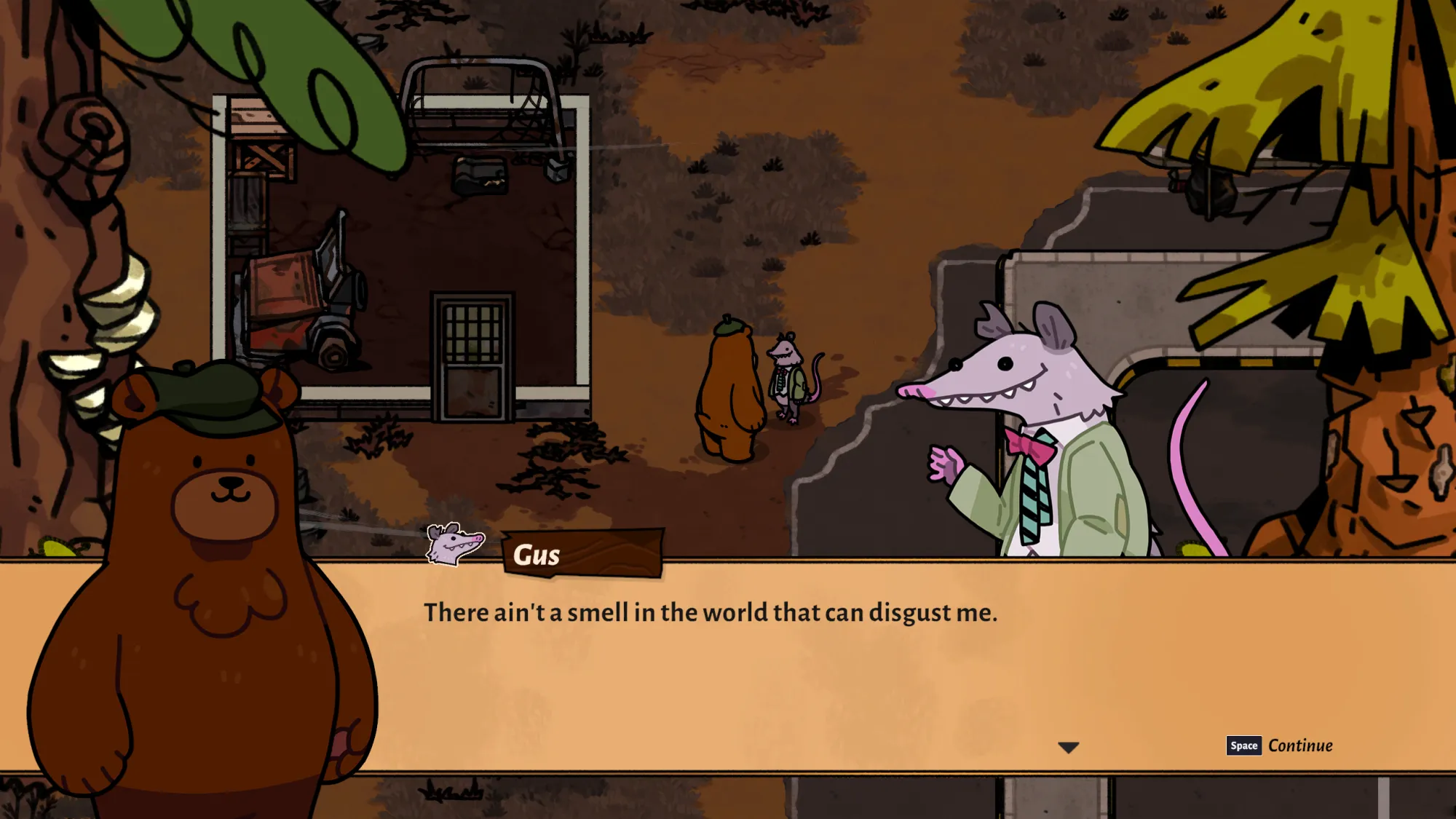
This opossum, Gus, is another wonderful example of stylized character design in Bear and Breakfast. They too have only a few shapes making up their face, and the pieces are arranged to give so much personality to the character. The spiky teeth and carefree expression lead us to think "who is this silly little critter? where do they live?". Seeing the suit and tie on the opossum is also an adorable little detail!
A balanced use of color is present in the character designs of Bear and Breakfast and that understanding of color can also be found throughout its beautiful environment artwork and backgrounds.
It's definitely worth taking a look at some of the stunning backgrounds found in the game.
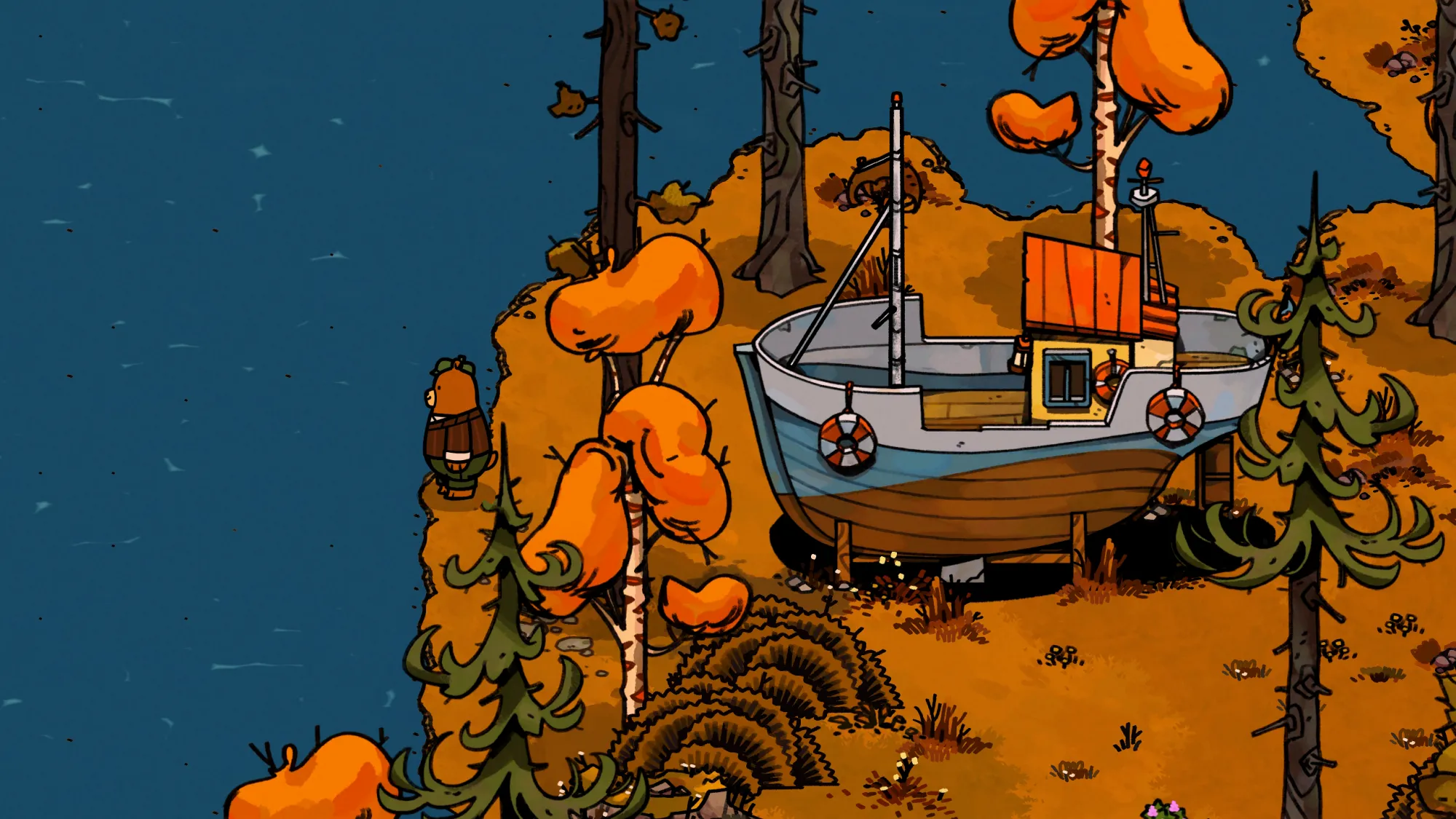
This scene of Hank all dressed up looking out to the water stands out for having such a beautiful use of color and contrast. The colors are well balanced, forming a split-complementary color scheme. The blue dominates the scene as the primary color, with the orange of the trees and ground and the green pines forming the adjacent complementary colors. Another way to think of it is as a ratio of 60-30-10 with blue, orange, green in that order.
Here are a few more examples of the detailed background art in Bear and Breakfast:
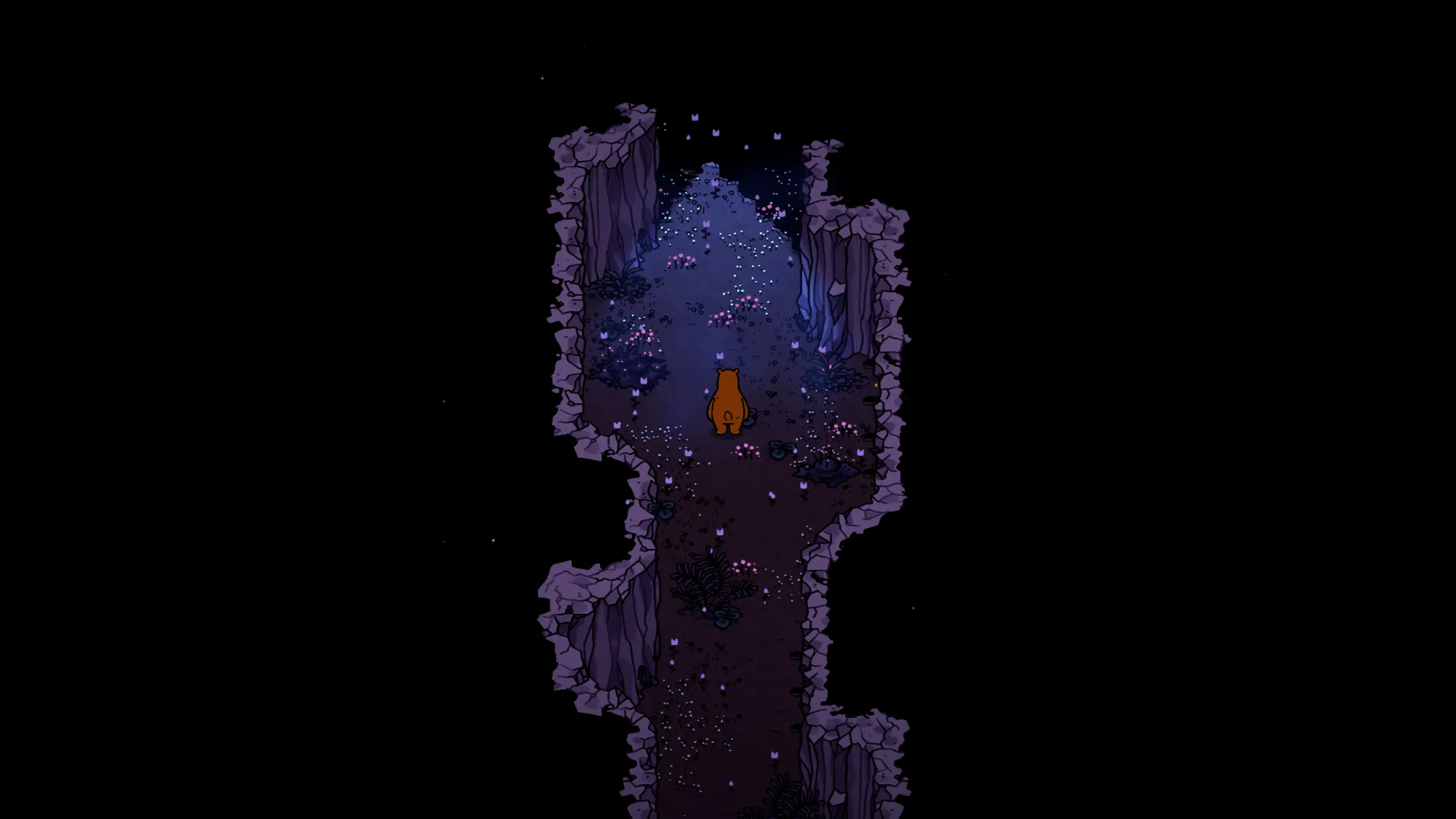
Each of these examples shows another aspect of the art. If you want to study more about creating simplified interiors for things like pixel art or illustrations this is a great source of inspiration. You can study the furniture in the bottom right image, for example, and practice the shapes and shading of simplified designs. (Don't forget to credit the creator if you use it as a reference, of course!)
There are purple caves that can show you how the contrast of black and lighter colors can create the feeling of mysterious environments. Even the way the lighting hits the grass can be a wonderful source to study for painting and creating cute art with bold lighting choices.
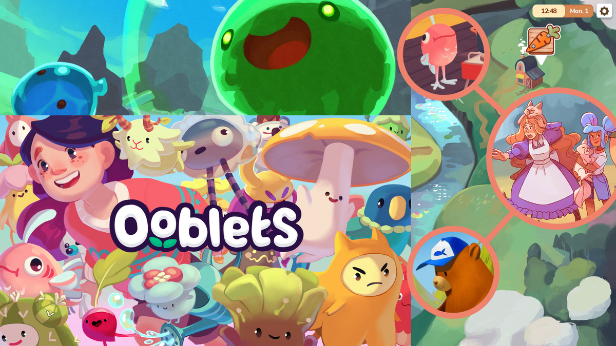
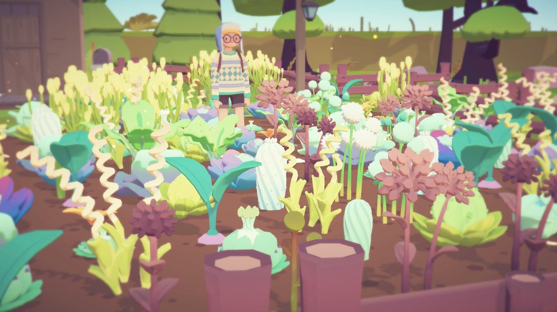
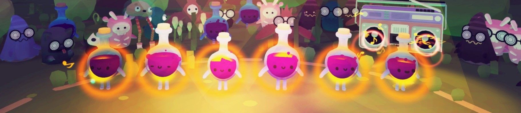
Ooblets
Ooblets is a creature collecting farm-management game with a funky flair that releases September 1st. This game has a cute and unique artstyle that makes its world feel so alive. Captivating use of color paired with the cute character styles of the Ooblets makes you want to keep exploring their wonderful world almost endlessly.
The colors in Ooblets are so vivid and really make the atmosphere feel inviting. Each environment seems to have its own special lighting and effects. Specific Ooblets or plants use different colors to show what categories into which they may fit. The colors are generally bright, bold, and overall very fun. You can study the use of color in the world of Ooblets and think about how you may be able to implement similar techniques into your own works.
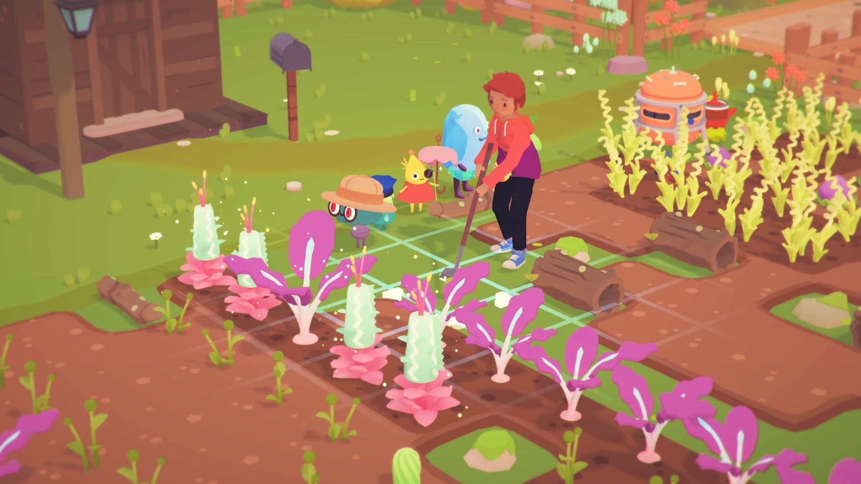
Ooblets environment art in the examples above use different green tones for the plants in the farm. The plant shapes are simplified and rely on color and negative space to help show detail. The pink leaves on the top left are a wonderful example of this, as the boldness of the pink really stands out against the dirt and grass.
Imagine painting a few turnips, radishes, or cacti using the images above as a mental reference point. You can experiment using a bold color like pink or green to create the shapes of leaves, and a lighter color for the body. You could then arrange them in a pattern or even use them on another larger illustration!
The art in Ooblets is colorful, bold, and fun. The character designs of the Ooblets are really skillfully done as well. They show a great understanding of using simplified shapes to make unique characters that stand out.
Ooblets character art is deceptively simple, as creating these kinds of iconic characters can be extremely difficult to master. The simple faces are easily replicable and immediately feel friendly. Many of the Ooblets are grown on the farm, and the strawberry Ooblet in the example above has very simple notes like the leaves on it's head that hint it could come from a plant.
You could try breaking your favorite Ooblets designs down into simple shapes and practice drawing them. Then, you can think about how objects or animals you've seen could be simplified into shapes for creating characters of your own.
From observing Ooblets, you can see that everyday objects can be a source of inspiration. You can push your use of stylization by playing around with familiar concepts in new ways.
These Ooblets above are little potion bottles with faces. They have a few colors which highlight the important aspect of the character design. Even a simple potion bottle looks like a really cute and collectable character after adding a little bit of creativity!
The art in Ooblets is colorful and wholesome. Through specific color schemes and masterfully stylized characters, the creators of Ooblets are able to deliver a wonderful experience full of love. There is definitely more to learn from studying the world of Ooblets, so feel free to check it out!
Cat Cafe Manager
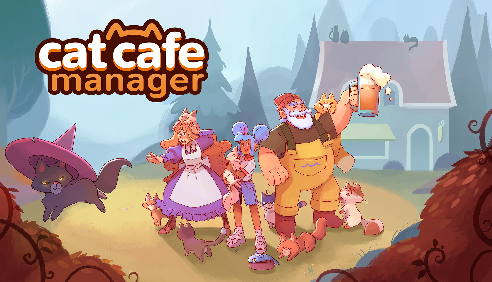
We always love a game about cats; Cat Cafe Manager is that and so much more! From Roost Games, Cat Cafe Manager is a really cute game where you run (and design) your own cat cafe. This game allows you to adopt cats and manage employees in a lushly painted environment. It features a wonderful use of color design in its background paintings, as well as stylized and effective character art. Studying the art of this adorable game would easily give you another perspective on creating cute, stylized art.
The artwork of Cat Cafe Manager is wholesome and bright. Their use of stylization adds to the overall atmosphere and feeling of the game world.
This beautiful illustration features the map of the area where the game takes place:
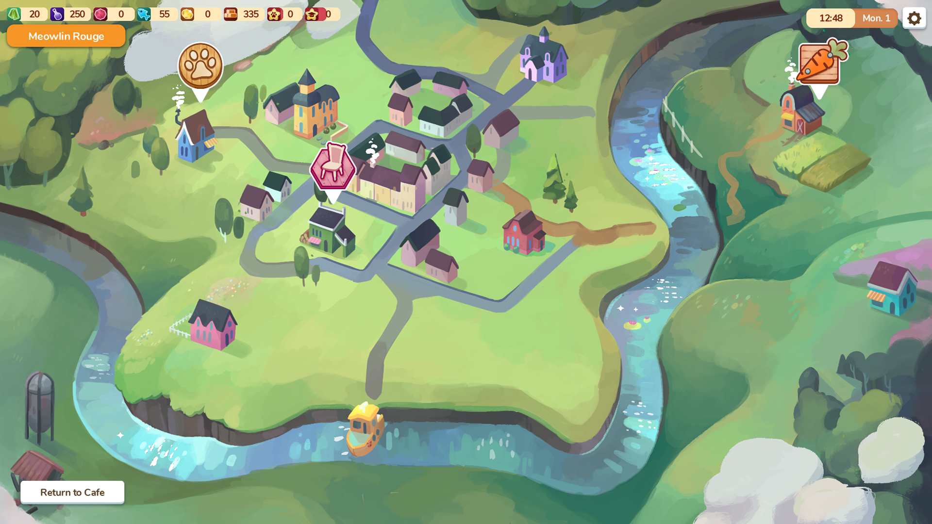
The art is both simple yet defined because it is so well stylized. The houses are detailed enough that you can tell what each one would be used for, but are still simplified almost to flat colors. The water running across the map is painted with such care; it looks serene and beautiful as it leads the player's eye.
This picture shows how simple painting styles can create the illusion of depth in a piece. There's a little bit of texture adding warmth to the piece, but most of the effect is achieved by how the artist uses their colors and layout to highlight the different regions of the map.
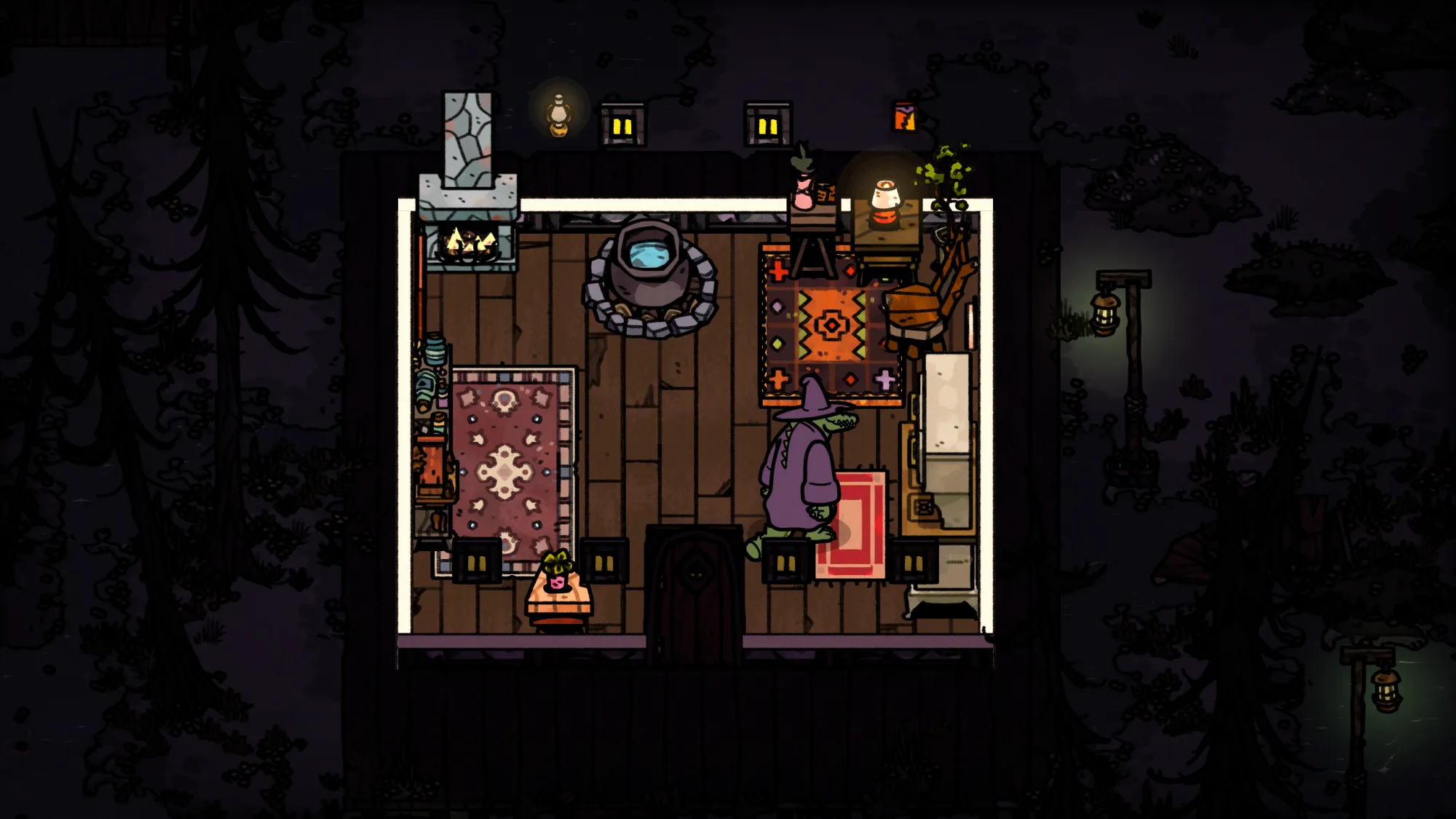
The interior spaces of Cat Cafe Manager are also very detailed, yet stylized. Through flat colors and strong linework, the elements that make up the actual cafe are still really immersive and detailed.
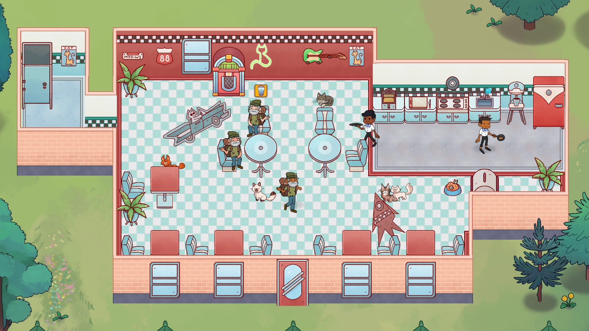
Things like the little cutting board and knife or the cat sign on the bathroom show an attention to detail that stands out. In your own works, you could think about how focusing on small details throughout a larger piece helps to add depth and character to the image.
The character designs of both the humans and the cats in this game are another example which really highlight the excellent use of color and detail.
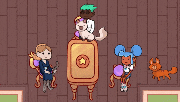
The people and the cats above are simplified versions of what a realistic one would look like; however, they are still very detailed and each convey something different. Each person has a totally unique outfit and hairstyle.
Just like in the key art, the characters here have bold colors that make them feel authentic and one-of-a-kind. The cats stand out and definitely encourage the player to collect them and see what kinds of different designs there may be.
By using color effectively and knowing where to add details, you can use similar techniques in your works. Consider creating specific color schemes for your characters that would work in a detailed painting or when drawing them in a more simplified form.
Slime Rancher/ Slime Rancher 2
Slime Rancher 2 releases sometime in September, and it's set in the all new location of Rainbow Island. Slime Rancher is a game where you play as a young scientist who farms and collects slimes as you explore.
This is another really cute game that can teach a lot about stylization and use of color. The world of Slime Rancher is artfully created with bold, vivid colors that are alien and altogether picturesque.
The environment art is unique and uses contrasting colors to put the player into an immersive scene. The characters, especially the slimes, are designed to be cute lovable and collectable.
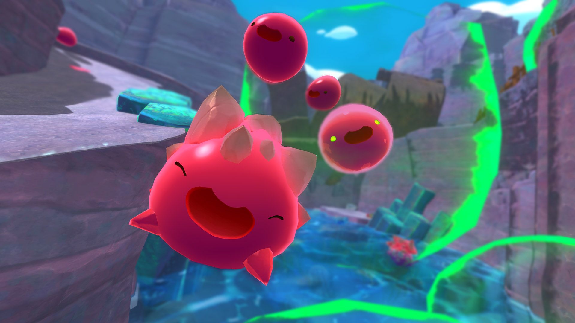
We've all seen slimes as enemies in video games, but this time the slimes are your friends, and the stylization of their faces and overall shape supports this.
The character art is colorful and bold. The eyes of the slimes are either simple lines or dots, and they usually have adorable bean-shaped mouths.
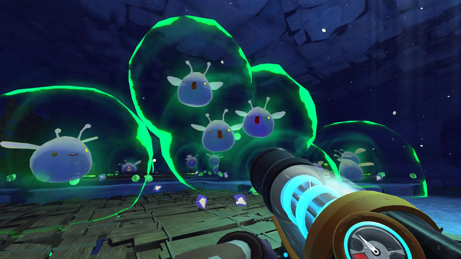
Through adding a few different characteristics to the basic slime form, the game is able to show the player what a slime in another environment may be like.
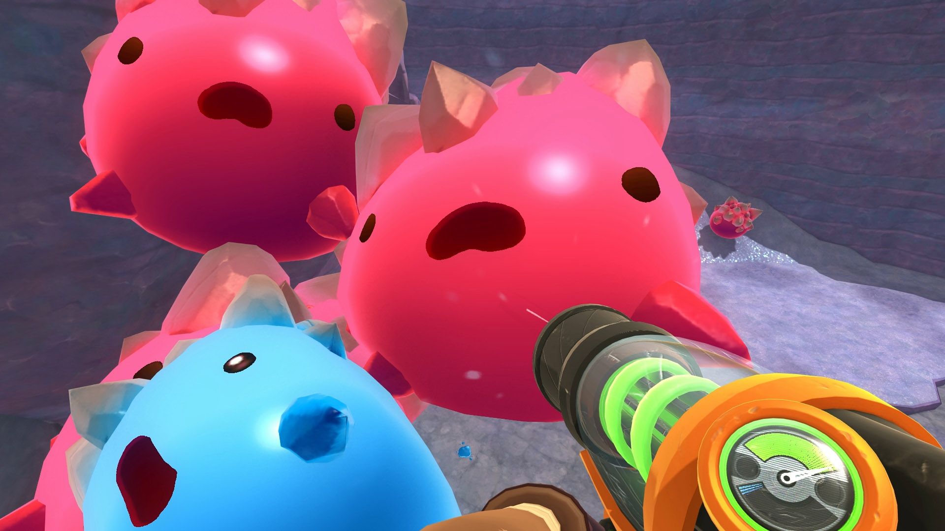
You can look at the difference in the pink spiky slime compared to the blue insect-like one on the left. The designer added antennae and wings and changed the color; these changes are small, but still completely alter the design into a whole new character.
When making your own cute characters, you could experiment with quick variations of some of your simple designs. Sketch a few circles, make something like a bunny. What would that bunny look like with wings instead of ears? What if it closed its eyes?
These kinds of thoughts are great for exploring character art. You can also apply similar thinking when looking at the environments and background art of Slime Rancher.
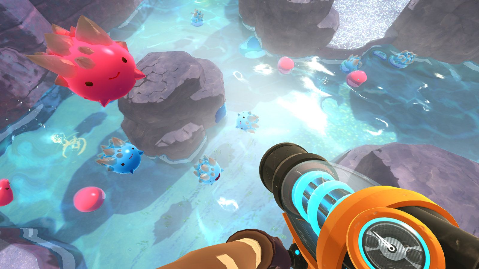
In this image above, the lighting creates the effect of water on a very sunny day. The bright white of the light is a stark contrast to the shadows of the rocks. The rocks are drawn with only a few colors, using the darkest to outline the shapes of the rocks. Using the colors in this way and adding perspective with the slimes makes this scene feel three dimensional and lively.
Focusing on crafting these artistic environments and using color in this way allows the artist to more accurately convey information.
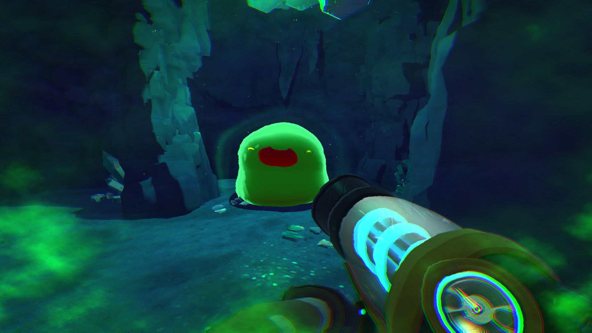
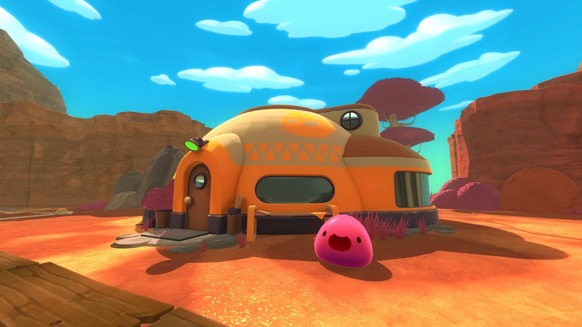
This adorable slime in a cave shows everything we've learned so far in one example.
The details of the stone mix with the neon lighting to show the nature of this cave the player is in. The slime is still really simple and adorable, but it seems to be almost glowing. The light green against the dark shows us that this slime likely originates in the green cave, and it could possibly be radioactive or magical in some way.
Thinking about what color choices say allows you to make the most of the colors you use in your work. Stylized character design can both save time and create an iconic, memorable look throughout your content.
These wonderful indie games are super cute and can help you improve at creating stylized art. Through simplified characters, specific color schemes, and detailed background art these games use the cute aesthetic to authentically express their ideas. Looking at games like these with an artistic lens can allow us to level up as artists and further develop our own skills.
We were so excited to showcase some of the cutest games; if you like what you read or thought of some more cute art ideas, feel free to share them with us on Twitter!
If you believe in supporting small teams with an authentic message, consider creating a profile over at UnVale and checking out our Discord server!